CONTEXT
An annual Learning Needs Analysis report for a large housing and leisure organisation: 27 pages covering skill gaps, emerging trends, and recommendations across five diverse teams.
01
CHALLENGE
- Translating complex data sets and skill gap analysis into something that felt credible in front of senior stakeholders.
- Creating a cohesive identity that could sustain interest and clarity across a high-volume, 27-page document.
02
SOLUTION
- A data-first design system that visualises skill trends before the reader even touches the copy.
- Strong visual signposting with oversized numerals and dark section breaks for easy cross-referencing.
- A professional, authoritative aesthetic that elevated the L&D team's internal credibility.
03
Design Decisions
Visual Language
The choices that give the document its consistency and character.
Colour Palette
Blue / Lav
Lav / Pink
Section
Light bg
Typography
01.
Chapter heads: oversized numerals
Key Finding: Section titles: bold, generous size
Body copy: Regular, leaded: readable in print
Design intent
Gradient running cover to final page creates cohesion across 27 pages without becoming repetitive.
Dark section headers give each chapter a strong visual entry point and aid navigation at a glance.
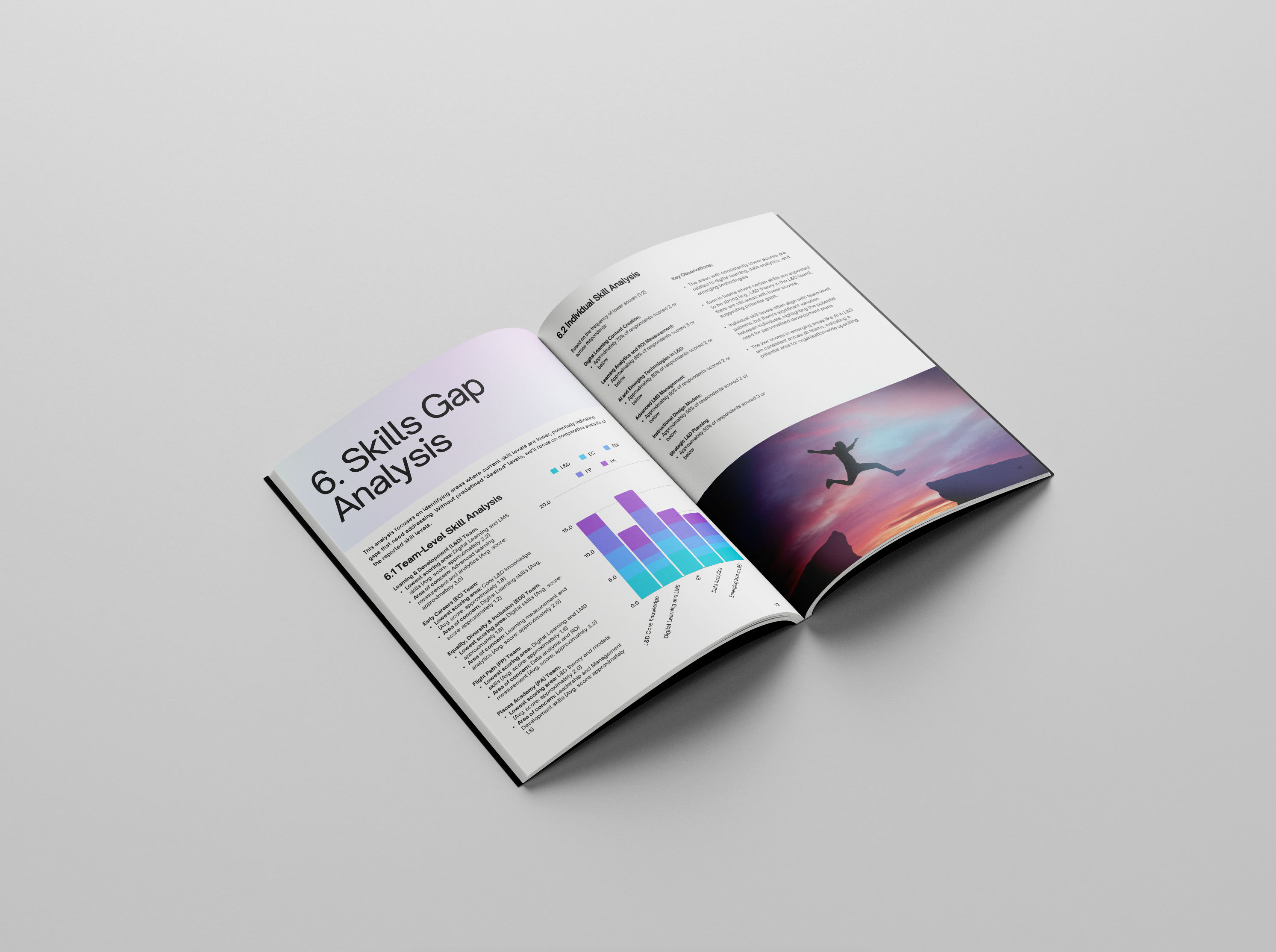
Data visualisations are built to show the insight first. The reader sees the shape of the data before reading labels.
Inside the document
Responsive Output
at a glance
27Pages designed end to end
8Skill categories visualised
5Teams represented in the data
17Respondents across the organisation
Previous Project
MILLERS
Next Project